Grid Layout
All layout in Ignite is handled using an invisible 12-column grid layout. You can subdivide those columns however you want, or let Ignite do it for you.
To create a grid, use the Grid element. Your columns will be subdivided to make space for each item you’ve placed.
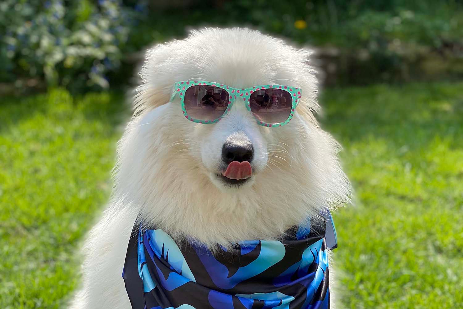
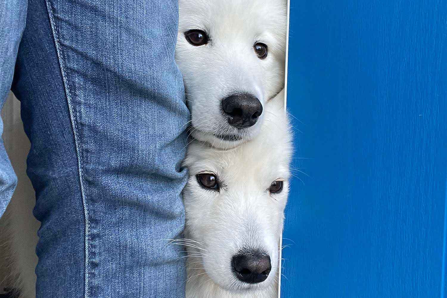
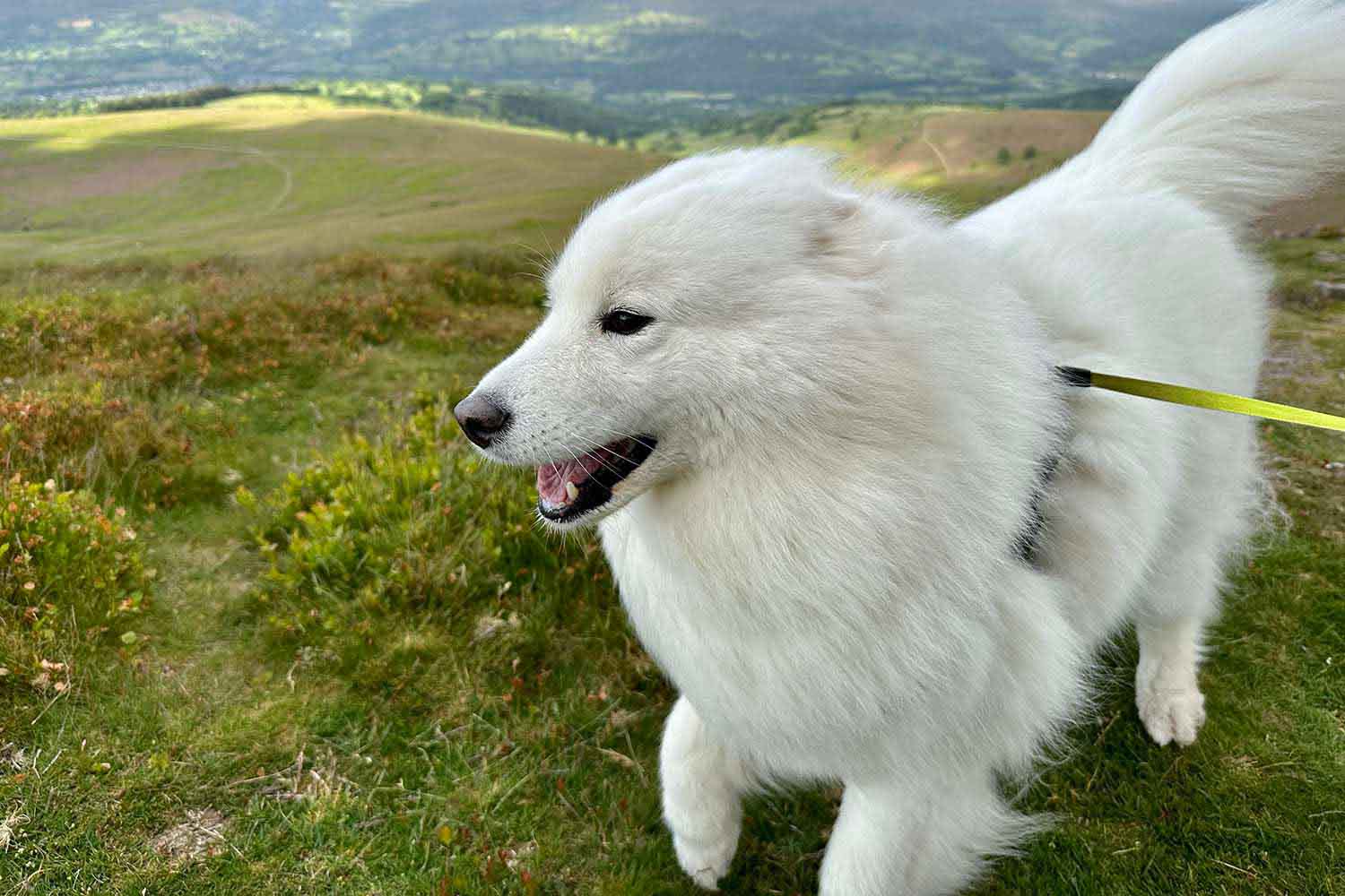
For example, these pictures all take up one third of the available space:
Grid {
    Image("/images/photos/shades.jpg", description: "A pair of sunglasses.")
        .resizable()

    Image("/images/photos/stack.jpg", description: "A door partly open.")
        .resizable()


    Image("/images/photos/wind.jpg", description: "A windy day.")
        .resizable()
}
You can also explicitly set a width for each element using the width() modifier.
This modifier automatically causes your views to rearrange themselves when horizontal space is restricted. For example, these pictures all take up one third of the available space when the browser window is wide, but all the space when the window is narrow:
Grid {
    Image("/images/photos/shades.jpg", description: "A pair of sunglasses.")
        .resizable()
        .width(4)

    Image("/images/photos/stack.jpg", description: "A door partly open.")
        .resizable()
        .width(4)

    Image("/images/photos/wind.jpg", description: "A windy day.")
        .resizable()
        .width(4)
}
Wrapping items
If you place more than 12 columns of items in a grid, they will wrap automatically. For example, this uses four pictures of width 4, causing one to wrap to the next line:
Grid(alignment: .leading) {
    Image("/images/photos/shades.jpg", description: "A pair of sunglasses.")
        .resizable()
        .width(4)

    Image("/images/photos/stack.jpg", description: "A door partly open.")
        .resizable()
        .width(4)

    Image("/images/photos/rug.jpg", description: "A nice rug.")
        .resizable()
        .width(4)

    Image("/images/photos/car.jpg", description: "The window of a car.")
        .resizable()
        .width(4)
}
Although 12 columns is the default, you can adjust it downwards if needed. For example, this uses a 2-column grid:
Grid {
    Image("/images/photos/shades.jpg", description: "A pair of sunglasses.")
        .resizable()

    Image("/images/photos/stack.jpg", description: "A door partly open.")
        .resizable()

    Image("/images/photos/rug.jpg", description: "A nice rug.")
        .resizable()

    Image("/images/photos/car.jpg", description: "The window of a car.")
        .resizable()
}
.columns(2)